
Elevate Your Email Marketing with Our Expert Insights and Strategies
Whether you’re planning your next e-newsletter, leveraging advanced marketing automation or orchestrating content from a CDP, now is the perfect time to revisit and enhance your email marketing strategy. Get inspired by the expert insights from the team at 9Rooftops below.
Interactive Email Elements: Elevate Engagement and Drive Results
Interactive emails enable unique interactions that allow subscribers to engage with content directly within the email itself. So by clicking, tapping, shaking or scratching your subscribers can actually interact with content instead of just looking at it.
There are countless creative ways to implement interactive features. A few of my favorites are:
Hover and Rollover Effects
Hovering over part of the email will activate a motion or animated effect
Gamification
Trivia/quizzes, polls, scratch-off, spin the wheel, choose your own adventure
Accordion or Hot Spot
Click to uncover/reveal/learn more
Benefits of interactive email features are:
Increase Overall Engagement
Martech Advisor found that “interactive email content increases the rate of click-to-open by 73%”!
Drive Urgency
Elements such as countdown timers and offer reveals (scratch-off, click, shake, etc.) create a sense of urgency and intrigue that will drive engagement.
Collect Zero-Party Data
Live polling and interactive games within the email allow you to collect zero-party data from subscribers, as well as interact with them in a unique way.
Here are a few important considerations when executing an interactive email campaign:
Purpose
While interactive emails have many benefits, there also needs to be a purpose for including these elements within your communications. Otherwise, it can feel really out of place for the subscriber. Make sure the elements you include support the overall messaging and are something your subscribers would actually be interested in engaging with.
Email Client and ESP Support
Not all email clients or ESPs will support all interactive email components. Work with your ESP to know what capabilities are available to you, and understand what email clients your subscribers are using to determine which interactive components to use. And always implement a fallback on each interactive component in case the component is not supported or doesn’t render as intended.
Mobile vs Desktop
Some components will render and interact differently on mobile and desktop (i.e., hover effects typically have to be a click on mobile since there is no cursor to “hover”). Understand what devices your subscribers are using to determine which interactive components to use.
Developer Level of Effort
Coding these elements does take more experience and time for a developer, especially if they haven’t coded anything like it before, and some of the more advanced elements may also require an expansion of your technology stack. When planning new interactive elements, make sure to build lead time for these executional areas to ensure your activation is a success.
Interested in making your emails more interactive? Contact us today to learn how we can help.
Email Data Unleashed: Cross-Channel Strategies for Success
Email marketing by nature has the ability to collect, generate and directly leverage extensive zero- and first-party data for your brand. And, with email addresses as a common identity resolution mechanism across marketing platforms — there are many ways to make the most of the data collected by your email marketing efforts, to expand its actionability and effectiveness beyond the channel itself.
Go to email data … and beyond, with the following applications which can extend its effectiveness.
Inform Paid Media Targets
Match subsets of your email marketing subscriber base to paid media audiences to enable cross-channel communications strategies, generate modeled lookalike audiences for high CLTV segments, or to suppress recent customers from receiving messaging. Secure data transfer methods are key here.
“43% of US marketers and agencies use proprietary identifiers like first-party data when transacting with media sellers, per Advertiser Perceptions.”
Increase Relevancy with Scoring
In addition to email personalization, if you’re capturing email marketing performance data at the individual level in your ESP or MAP, you’ll have it available for use in other channel marketing, ideally by tying that behavior back to a centralized CRM record. Engagement data — especially that for email — can be a valuable input for scoring models. For example, if a subscriber consistently clicks to consume content type X, you can score or model on that behavior, and once it reaches a qualifying threshold consider weaving more of content into their experiences with your brand in direct mail, SMS, web, social, etc., or, remove questions about that area from a progressive profiling form.
Uncover Signals for Demand
Email interaction data can serve as an indicator of brand consideration, content interest or sales demand, and for some segments a strong prerequisite to purchase intent in your customer journey. Consider a correlative, or customer journey mapping analysis between observed actions within and outside of email marketing, to understand what’s forecastable from your email data.
Just ensure you’re grounding findings in the latest changes and limitations in tracking as privacy policy across the industry, key OS and device types change. Not all observed actions — particularly opens, in recent months — are reliable and should be analyzed with some inflation in mind.
Interested in making your email data work harder for you? Let’s ideate — connect with us.
Streamlined Success: The Power of Email Marketing Automation
Marketing automation and triggered communications are essential to brands due to their ability to create higher engagement and customer retention through real-time, one-to-one messages. These timely and relevant messages are deployed based on consumer actions or when criteria are met along the customer journey, creating more value for consumers. Each message should be curated specifically for each touchpoint and channel, organically moving the consumer along in their journey with the brand, often including increased personalization and relevance.
Automation enables brands to create an experience informed by their consumers’ behavior and preferences. Behavioral and experimental insights can be used to engage customers at different points of the funnel, utilizing data such as search terms, time spent on a webpage and geo-location. Additionally, through activating campaigns and messages in multiple channels, especially the preferred channel of individual consumers, brands create more touchpoints that strengthen their relationships and drive higher engagement and impact.
It’s extremely important for brands to understand the full consumer messaging journey. As contacts receive automated communications, they might also be receiving ad hoc promotional and other qualifying messages. Setting an audience hierarchy keeps brands from over-communicating and prioritizes deploying the most relevant communications to drive forth the desired goal for each audience, whether it’s conversion, retention or win-back.
The key to automation is not having a “set and forget” mentality. Brands should create a plan based on business goals and engagement benchmarks, then regularly review results to adjust their automated programs and improve strategy. This will result in continuously creating convenience and an improved experience for consumers as the industry and behaviors change. Ultimately, automation optimization develops relationships with consumers at every stage of the consumer journey, delivering timely and targeted information to increase conversion rates.
Want to see how our expertise in automation can create a better consumer journey? Contact us today!
B2B Email Strategies: Boosting Efficiency and Uncovering Opportunities
Email marketing isn’t just for B2C brands! B2B companies can benefit immensely from implementing an email marketing strategy. The key is a true partnership between Sales and Marketing, otherwise the customer can be bombarded, ignored or sent irrelevant messages that could jeopardize a sale.
There are two key benefits to implementing email marketing for B2B:
Increases Efficiency
Email marketing can take on some of the tedious follow-up communications and enable Sales to focus time and effort on the accounts that actually need their attention.
Uncovers Opportunities and Provides Business Intelligence – Sales data can inform Marketing on what and when to send, and Marketing can inform Sales on email engagement for more informed and targeted personal follow-ups.
A few key areas where we apply email marketing for B2B clients:
Welcome and Lead Nurture
Aid sales in qualifying incoming leads and nurturing them down the funnel.
Customer Onboarding and Retention
Support Sales efforts by continuing to retain existing customers throughout the buying cycle.
Reengagement
Proactively identify and re-engage lapsing customers.
In order to implement a successful and strategic B2B email strategy, there are a number of things to keep in mind:
Align Sales and Marketing Teams to the Strategic Approach
Make sure the teams know what the other is doing, and keep one other informed of any changes.
Provide Sales with Visibility into Communications that Are Being Sent and Scheduled
So that they don’t send a repetitive or contradictory message.
Empower Sales to “Turn Off” Marketing if Needed
Sales manages the relationship, so they know best the sentiment of an account.
Looking to take your B2B email marketing to the next level? Contact us.
Crafting Connections: The Impact of Email Personalization
Personalization is a proven way to increase brand open and click-through rates and build lasting relationships with subscribers, and can have a measurable impact on conversion rates and revenue. However, gone are the days of just using contact first names for email personalization. Consumers are increasingly demanding more relevant and tailored experiences from brands. By leveraging subscriber data within content and utilizing it for targeting, email communications are more relevant and feel tailor-made for individuals.
Brands can measure up to consumer expectations in creating a more personalized interaction by utilizing some of these personalization tactics:
Dynamic Copy & Imagery
Display content and images that better appeal and provide relevance to specific subscribers using zero-party and first-party data such as first name, location, product preference, etc.
Product Recommendations
Integrate subscriber’s recent purchase and browse history to increase conversion rate through cross-sell and upsell recommendations.
Demographic Targeting
Utilize data attributes that group audiences based on characteristics such as geographic location, age, gender, occupation, income and lifestyle.
Engagement & Behavior Patterns
Utilize historical behaviors and email engagement patterns to determine optimal send time, click and open prediction scoring, provide personalized offers and implement dynamic content modules.
Subscriber Self-Segmentation
Through email preference centers, subscribers can tell brands exactly what they are interested in and what content they want to receive. Subscribers have the ability to enter or change any personal information they want to provide to a brand, and determine communication frequency and channel preference. This data can be used to update or create new segmented lists for targeting.
Relevant content matters to subscribers and makes them feel important to the brand. According to Litmus’s 2024 Email Personalization Guide, personalized emails deliver 6x higher transaction rates than emails without personalization. They are key drivers in connecting effectively with prospects and customers, so it’s important to revisit your personalization capabilities regularly to ensure you’re maximizing results!
Interested in discussing how email personalization might advance consumer engagement? Reach out to us.
Creating Impact: Six Essentials for an Optimal Inbox Experience
The inbox experience is crucial to how an email is consumed by subscribers, along with a direct impact on engagement level. With the average subscriber only spending nine seconds reading an email (Litmus – https://page.litmus.com/trends-in-email-engagement), brands have a limited amount of time to stand out, make an impression and entice subscribers to take a desired action.
On average, 30% of emails are glanced at for less than two seconds, while 41% hold the reader’s attention for two to eight seconds. Only 29% of emails are looked at for more than eight seconds.
Here are a few key features to creating an ideal inbox experience, maximizing the impact on subscribers:
Branding
To further ensure your brand stands out, BIMI (Brand Indicators for Message Identification) can be implemented. This inbox feature enables authenticated brands to display their logo within supported email clients, helping with brand recognition at the inbox level and ensuring subscribers of the authenticity of the message. While having a profile picture associated with a personal email account has been a feature offered by email clients for some time, the capability for brands to implement images that display next to their communications has not been an option — until now. Branding within the inbox also includes having a “friendly from” name and a dedicated sending domain that match your brand and message intent. All of these elements together reinforce brand recognition and create a trusted experience with the brand message.
Subject Line/Preview Text Optimization
Subject lines and preview text are a brand’s first impression with subscribers in the inbox. These elements work in conjunction to help provide context into the email content and answer the question “Is this email worth opening?” It is important to be mindful of character limitations for both subject lines and preview text. While these limits vary based on device and a user’s browser window size, there are still guidelines to ensure your full message is displayed within the inbox. With more than 60% of users reading email on a mobile device, it is best practice to keep subject lines within 35 characters and preview text around 45 characters. The most important parts of the message should be included within the first 10 characters to ensure that all users can receive a full preview of the context of the message.
Elements that make for an effective subject line include urgency, timeliness, relevance and value-added language. Also, keep in mind, emojis should be used sparingly and only when they provide additional context.
Rendering
Emails need to have a consistent experience across all devices and browsers. Before deploying an email to subscribers, it’s important to ensure that all design and interactive elements align with your brand’s standards and intentions in the email. The user needs to be able to read and interact with the brand message without barriers hindering the experience. Text formatting and design elements can drastically change depending on the device a subscriber is using to view an email. So it is critical to complete a rendering test prior to deployment to ensure the message looks and acts as intended, whether it’s on an iPhone 14 in Dark Mode, or Gmail on a Google Chrome desktop browser. Also, mobile optimization and responsive design are key to rendering testing as the majority of users read emails on a mobile device. Emails are usually read while people are on the go, so it is important for users to be able to read and interact with the email on a device they frequently use.
Properly Testing Links
An extension of rendering, testing links is crucial to the inbox experience. If a link goes to an incorrect page, it could have a massive impact on the ROI of a campaign. For example, let’s say the goal of your email is to get subscribers to purchase a product from your e-commerce site. If the CTA is “Shop Now” and an error occurs because of a mistyped URL, then all the clicks to that incorrect URL are basically lost purchases. Furthermore, if there are improper UTM parameters, that also affects the measurement of results across channels. Test all links before sending an email.
Alt Text
Emails need to be accessible to all users and recipient scenarios. Alt text ensures that images can be read without having to rely on the full image design to know what the image is. It is important, however, to have the alt text describe exactly what the image is while also being concise. The reader needs to know exactly what they are supposed to see so they can understand and process the message.
ISP Requirements
Make sure you’re keeping up with the latest and greatest requirements from your top ISPs to ensure inboxing success. For example — in February 2024, Gmail and Yahoo enforced new sender requirements to protect users and prevent spam and unwanted messages from getting into email subscriber inboxes. To do that, the code must be customized (if it has not been already, since it has been a standard since February 2024) to ensure that your brand is compliant with Gmail and Yahoo regulations.
Looking to optimize your email inbox experience? Reach out to us for expert guidance.
Accessible Emails: Reaching and Engaging Every Subscriber
Creating accessible emails ensures that all your subscribers, including those with disabilities, can engage with your content. By adhering to accessibility best practices, you not only promote inclusivity but also enhance the user experience and widen your audience reach. Dive into our expert tips on how to make your emails more accessible and effective for everyone.
Adhering to compliance will:
- Promote inclusivity
- Help you reach a wider audience
- Enhance the user experience
- Demonstrate social responsibility
- Avoid costly litigation
That being said, here are a few best practices that can help you in your quest for email compliance.
Utilizing Emojis
Emojis can help add a tone to your brand voice, subject lines and various other touchpoints in an email. This has been an emerging trend in email spaces. There are a few things to keep in mind when using emojis in an email.
- Never replace a word with an emoji
- Emojis should always be at the end of a subject line.
- Never use emoticons (they are read as punctuation by screen readers)
Alt Text for Images
Having descriptive alt text for images is a common best practice in compliance. It helps in many ways. An example would be that a screen reader can describe what the image is to a user who is blind.
Readable & Email-Safe Fonts
Generally we want to stick to a font size somewhere between 14–16px. This is so users can comfortably read our content without struggling. Additionally, using email-safe fonts is a great way to help mitigate any other issues that may arise from an unsafe font not displaying properly.
Proper Color Contrast
This is one of the most important guidelines to follow, as it can be the difference between an excellent experience or a poor one. There are various contrast checkers available that can help identify areas where colors may need adjusted, but knowing the guidelines prior to executing a design can help to cut down on rework. Generally when starting a project, if you’re not absolutely sure that the colors in use have been checked for compliance, you should check them yourself.
Test Your Email Without Visuals
By testing an email without visuals, you can identify compliance gaps and remedy them prior to sending out an email that many users will have difficulty with. This also helps to ensure that your email content still shines through inside of various clients, like Outlook where you have to click a button to download images.
These are just a few ways to help your emails reach the widest audience possible by adhering to compliance standards.
Want to make your emails more accessible and inclusive? Contact us today.
Dark Mode Design: Enhancing Email UX
In the ever-evolving landscape of UX design, certain trends emerge that not only capture our attention, but also become enduring elements shaping the digital experience.
Whether you choose dark mode for the aesthetics or it helps you have a better reading experience, that data shows it is now favored by a staggering 81.9% of smartphone users in 2024.
But, what exactly is Dark Mode in email design and why is it significant?
Dark mode in emails is a setting in email clients which displays the email’s components of text, email icons and UI elements as light-colored on a dark background.
Here are some reasons why using dark mode can be beneficial:
Better Reading Experience
Dark mode’s dark background reduces blue light and screen glare, creating a comfortable reading experience, especially for users checking email in the morning or evening.
Enhancing Focus and Attention
Dark mode highlights important elements in emails by minimizing background distractions, allowing the content to stand out.
Improves Email Accessibility
Users with visual impairments, light sensitivity or certain visual disorders find dark mode to be a friendlier option. This ensures that digital experiences are accessible to a broader audience.
So, which email clients support dark mode?
The chart below is a list of email clients that support dark mode. Some partially or fully convert your emails into the dark mode, while some show no color change for HTML emails in dark mode.
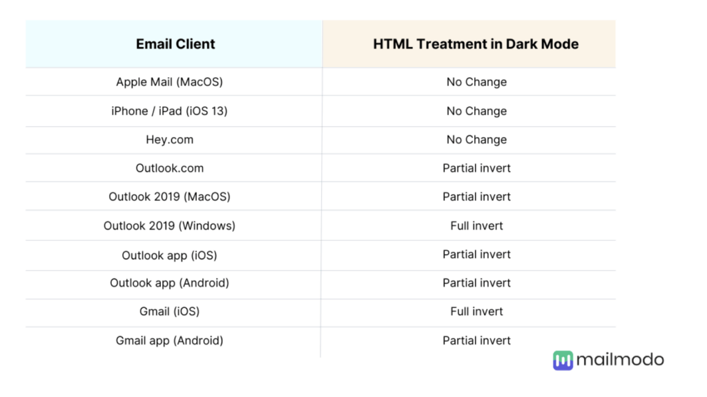
Here’s how the above email clients display dark mode emails by default:
No Color Change in Dark Mode
Users can update the surrounding user interface of the email platform, but there’s no actual change to the HTML rendering of the email.
Original Design
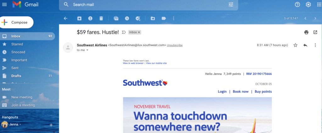
Dark Mode
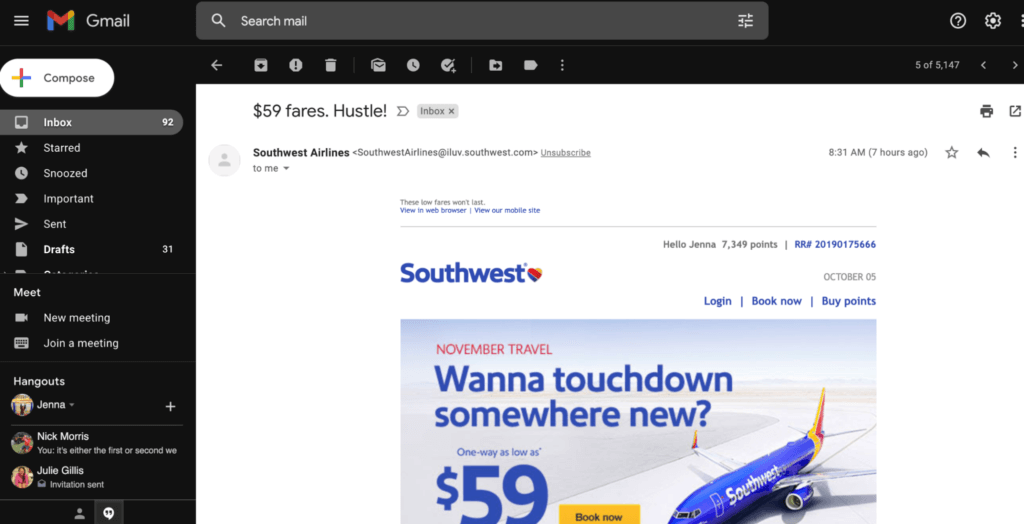
Partial Color Invert
Partial color invert is when email clients detect light backgrounds, convert them into dark backgrounds and make the dark text light in color.
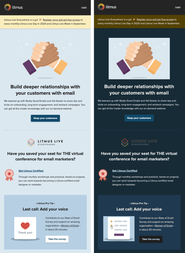
Full Color Invert
Default full-color inversion by some email clients is the most meddlesome change among all the other default changes. It inverts both a light and dark background. So even if you have a dark-themed email, it’ll make them light.
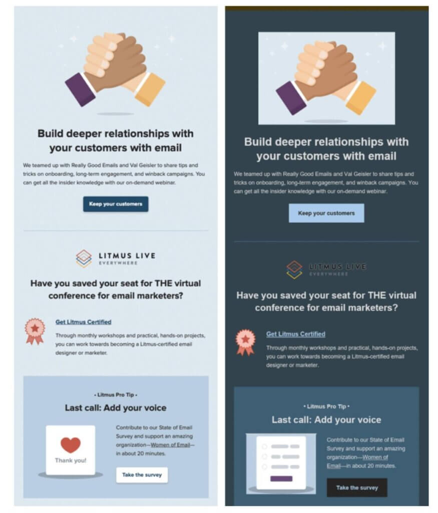
The above example doesn’t look great if you look closely, Here’s how you can optimize emails for dark mode.
Make Sure to Use Enough Color Contrast
Ensure your background and text colors have sufficient contrast to be easily visible in both regular and dark color schemes.
Optimize Logos and Images with Transparent Backgrounds
Use PNGs for your images to avoid a box displaying around them in dark mode.
Use “Invisible” Borders for Padding in Designs
Some email platforms render background and border colors differently in dark mode. That means that if you use the same color for a background and a border, they may not render the same color in dark mode.
Add a White Outline to Dark Images & Fonts
Make sure your black design elements don’t become invisible against dark backgrounds.
Test the Dark Mode Emails to See How They Render.
I think it’s safe to say that dark mode is here to stay. Dark mode isn’t merely a design choice; it’s a commitment to creating emails that are visually engaging, inclusive and user-friendly.
Ready to optimize your emails for dark mode? Connect with us today.
Designing for Impact: Email UX Fundamentals
Creating an effective email design may seem similar to designing a web page, but there are many unique factors to consider to ensure your message resonates and displays as intended. There are three main components in email design: Header, Body and Footer.
In the header, we can expect to see the company logo to reinforce and confirm our brand identity. It’s even better to include any personalization if possible and help the user feel they’re getting a unique and tailored experience. If relevant, you can include a functional menu to various parts of your website, but should be wary of distracting the user from the purpose of the email. Lastly, always include a way for users to view within their browser.
The body of the email is where the creative phase begins. There are a few limitations to keep in mind but plenty of ways to create stunning email designs. It’s important to consider the main message of your email and craft an image/visual to accompany it. It can be as simple as using relevant imagery of the product or brand, or be a mixture of icons and illustrations alongside a GIF of kinetic typography advertising the latest announcement. As you experiment with different options, be mindful of the file size of each asset and how it may impact the overall message if not loaded properly.
Finally, the footer captures any remaining important information, meaning it should be easy to read. It’s best to keep it on a solid color background and not go below a minimum of 9px. This is where the unsubscribe link, legal/privacy notes and other contact information will live.
These are some of the basics to keep in mind, please reach out for more information. We’re happy to brainstorm and figure it out.
Want to enhance your email UX design? Reach out today.
Embracing Technological Advancements: Email Development
Staying ahead in the ever-evolving world of email development means embracing technological advancements, while continuing to meet evolving user expectations. Understanding and adapting to these changes is key in helping define your business needs, shaping your future goals and remaining competitive in delivering effective campaigns and marketing strategies.
Here are some essential strategies to ensure your campaigns thrive:
Accessibility: Semantics Lead the Way
Writing semantic code for your email campaigns ensures that your marketing strategies and development efforts are accessible and compatible for your audience. By prioritizing semantic code, you are already taking a significant step toward accessibility. This step provides structure and clarity, making it easier for assistive technologies like screen readers to interpret content accurately.
By reducing the need for coding workarounds, you can benefit even more from semantic code by keeping a cleaner and more maintainable code base. This ensures you are prepared for future integrations with emerging technologies such as Artificial Intelligence, Augmented Reality or Voice Activation, which may offer a unique and engaging opportunity to subscribers.
Are Frameworks Friend or Foe?
Developing emails that are flexible enough to be consistent across email clients while being semantic and accessible can be a challenge. Using a framework provides access to components and a set of best practices when developing. With proper tooling you can ensure consistency and compatibility across multiple platforms, all while allowing for a more rapid development cycle with higher-quality code.
Testing Tools: Ensure Email Excellence
Utilizing testing tools is a great way to gain some peace of mind that your email campaigns will be accurate and successful. It can also contribute to improving email deliverability and enhancing the user experience. While most marketing automation platforms have rudimentary preview and testing functionalities, third-party tools — such as Email on Acid — provide additional useful functions such as spam testing and accessibility checks.
Sentient Subject Lines: Utilizing AI
While AI isn’t set to replace the need for a developer, the power of AI can be used to brainstorm ideas, identify coding errors, automate repetitive tasks or suggest improvements based on previously used code. Understanding how and when to leverage these types of tools helps to push the boundaries of email marketing development.
Staying focused on these areas help developers prepare and evolve to the ever changing landscape and continue to help deliver compelling and effective marketing campaigns.
Interested in advancing your email development strategies? Contact us today.
Integrating DX and CRM: A Seamless Digital Journey
The Digital Experience — typically thought of as being centered more around websites, is really about the overall digital experience across channels, platforms and devices. The relationship between DX and CRM is a close one, and integrating the two is critical for an effective journey. CRM helps to track the user across many touch points, to understand the entire customer lifecycle and provide key insights and user data to inform the website design and overall experience.
Since CRM programs collect and manage customer data, it also allows for more website personalization by providing the data so the journey can be individualized, which has been proven to increase engagement.
The informed website design look and feel is carried over into the CRM experience, allowing for a seamless and familiar experience that enhances the customer relationship. That, combined with following all DX best practices for ADA compliance, dark mode, deliverability, mobile and legal compliance provides impactful communications built to achieve their marketing goals.
Contact us today to learn how our seamless digital solutions can enhance your customer journey.
Meet The Team
With expertise spanning digital experience, customer relationship management, user experience design and digital development, we bring a wealth of knowledge and creativity to every project. Our strategic thinkers, skilled developers and innovative designers work collaboratively to craft data-driven, user-centric experiences that drive engagement and growth.
This is not an advertisement, and solely reflects the views and opinions of the author. This website and its commentaries are not designed to provide legal or other advice and you should not take, or refrain from taking, action based on its content. Additionally, unless otherwise stated, neither 9Rooftops nor the author is involved in, or responsible for, the marketing or promotional efforts of the individuals or entities discussed.


